THE CHALLENGE
Diagnosing the digital disconnect
DI.Q.Easy, a B2B digital marketing startup, relied heavily on word-of-mouth referrals, a channel that could not scale with the business. As referrals plateaued, Instagram became the company’s primary digital touchpoint for inbound discovery. However, despite consistent posting, the platform failed to generate meaningful inquiries or support client acquisition. First-time visitors struggled to quickly understand the company’s value, credibility, and service fit.

My Role
Platform : Desktop | Company : DI.Q.Easy | Duration: 2025
My responsibilities included user research, A/B testing, competitive analysis, usability testing. Designing a new website and visual redesign, social media design, creating high fidelity wireframes and prototypes, for hand-off to developers.
Tools: Figma, Figma Make, Illustrator, Jitter, ChatGPT
What changed after redesigning
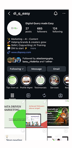
Following the redesign, DI.Q.Easy saw a 14700% surge in weekly post views and expanded brand visibility by reaching 96% more non-followers accounts and a 1,111% increase in follower count (from 54 to 665), compared to the pre-redesign baseline.


THE DISCOVERY
Visibility Wasn’t the Problem - Decision Clarity Was
Word-of-mouth worked well for early traction, but it introduced two limitations:
Growth depended heavily on personal networks
Lead flow was unpredictable and difficult to scale
Instagram was expected to offset these limitations by attracting and converting new prospects. Instead, it functioned primarily as a passive presence rather than an acquisition channel. Initial analysis showed that visibility alone was not the core issue.
I did competitive analysis, conducting extensive reviews of various digital marketing websites, focusing on the Indian market.
All the established agencies used a website for online presence along with social media channels


To understand what was missing in the digital presence of DI.Q.Easy I conducted A/B testing comparing the company social media pages of DI.Q.Easy to digital marketing websites. 53.8% of the users did not find the Instagram page to be informative. 60% said they would click on a website to know more about the company after seeing an ad rather than an Instagram page as the Instagram page appeared cluttered.

No
Yes
53.8%
46.2%
I clearly understand the details of the company from the Instagram page?

Imagine you are scrolling through Instagram and you see these ads (1) and (2). (1) takes you to an Instagram page and (2) takes you to a website. Which of these you would you click on?
Website
Majority of the users said they would like to get more information about the company on the Instagram page first before proceeding to the website. Instagram page right now was lacking authenticity and information.

Yes
No
53.8%
46.2%
I clearly understand the details about the company from this Instagram page?
Business goal
Established consistent
brand voice and presence
Increase engagement and expand audience reach
Why First-Time Visitors Failed to Convert
Mapping the first-time visitor journey surfaced a clear pattern. Most users dropped off during the profile scan, where they were forced to infer value, trust, and next steps instead of being guided through them. Rather than optimizing individual posts or increasing content volume, the core opportunity was to restructure the profile itself as a decision-making surface, similar to a landing page.
Post appears in feed/explore
Profile visit
5-7 seconds profile scan
Decision

Yes
No
Visitor journey from discovery to action
KEY INSIGHT
Instagram posts attracts attention but the profile drives decisions.
Reframing Instagram as a Conversion Surface
How might we help first-time Instagram visitors understand who DI.Q.Easy is for, why it’s credible, and what to do next within seconds?
Designing for a 5-Second Decision Window
Low-fidelity artifacts were used to prioritize clarity over visual polish. The redesigned profile followed a clear order:
1. Outcome-oriented value proposition 2. Audience and service fit 3. Trust and credibility signals
4. High-level services or process 5. A single, low-friction CTA
Each element answered a specific user question and reduced uncertainty. Instagram was treated not as a social feed, but as a lightweight funnel designed for rapid evaluation.


Instantly communicate what you do and why it matters
Clear value proposition
Client results, testimonials, and case studies
Trust Signals

Pinning posts that clarified positioning, clear breakdown of the company's offering
Content pinning

Simple next step to start a new conversation.
Low friction CTA
Instagram profile as a landing page
Using visual consistency to build trust faster
After identifying the problems in DIQ.Easy's online presence I created a brand system that brought the brand and the work done by DIQ.Easy to life.The brand's new tone is - fresh and approachable. From the logo to color palette to typography everything reflected what the company wanted to convey with the transformation.
With type, illustrations, iconography every element is a visual representation of the brand. All visual decisions were made in service of faster trust formation.


Visual consistency was introduced to reduce cognitive load and increase perceived credibility during evaluation.

Before

After


Designing a website that establishes a confident online presence
To support the online presence of DI.Q.Easy, I designed a website with playful visual elements, animations and fresh bold colors, providing information about the work done by the company.


Before and After: Reducing Decision Friction

Before
Visitors had to interpret the offering themselves
Value and differentiation were unclear
Trust signals were difficult to find


Positioning and outcomes were immediately visible
Credibility cues were structured and intentional
The path to inquiry was explicit and low-effort
The experience shifted from passive browsing to guided decision-making.
Reflections
This project reinforced that:
-
Conversion issues often stem from unclear decisions, not lack of traffic
-
UX principles apply beyond traditional products and websites
-
Thoughtful scoping and restraint can be more impactful than broad redesigns